Introduction to Living Room Colour Schemes
✍️ The significance of colour schemes in interior design cannot be overstated, particularly when considering the living room, which is often regarded as the heart of a home. This space serves not only as a gathering place for family and friends but also as a representation of personal style and comfort. A carefully curated colour scheme can greatly influence the mood and ambience of the living room, effectively shaping the experience of those who occupy it.
Colour has a profound psychological impact, and the right combination can evoke feelings of tranquillity, warmth, or energy. For instance, warm tones such as reds and oranges can create a welcoming atmosphere, while cooler shades of blue and green may promote relaxation and serenity. Beyond emotional influence, colour schemes also play a vital role in the perception of space. Lighter colours can make a room appear more expansive, while darker hues can add a sense of intimacy or cosiness. Thus, understanding how to effectively use colour can significantly affect the usability and aesthetics of a living room.
Designers often employ distinct colour schemes that have been tried and tested over time to create visually appealing and harmonious spaces. These schemes not only ensure that elements within the living room complement each other but also reflect broader trends in interior design services by Interior designers in Mumbai. By analysing various palettes and their effects, homeowners can make informed decisions on how to enhance their living spaces. This sets the stage for diving deeper into the specific no-fail colour schemes that designers favour, ensuring that the living rooms are well-coordinated, inviting, and stylish.
1. Timeless Neutrals
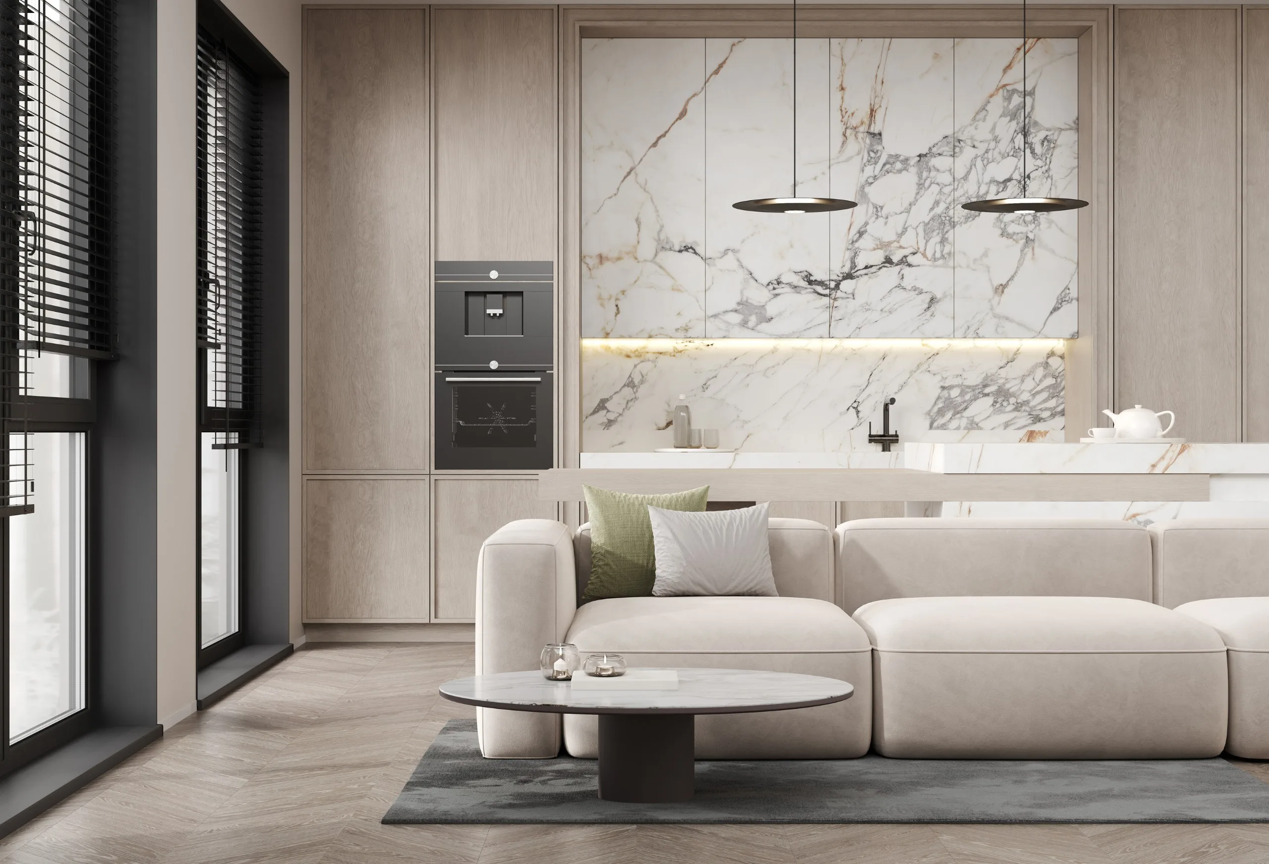
🏡 When selecting a colour scheme for the living room, one cannot overlook the timeless appeal of neutral colours. This palette typically encompasses shades of white, cream, gray, and beige, all of which are beloved by designers for their inherent versatility and ability to create a calm, serene atmosphere. Neutral colours serve as an ideal foundation upon which various styles and personal touches can be added, thus making them a perennial choice in interior design.
The foremost advantage of using neutrals is their capacity to complement virtually any decor style—from modern minimalism to traditional elegance. Designers often favour these colours because they allow for easy transitions and modifications as trends evolve. A living room decorated in a neutral scheme can effortlessly adapt to changing seasonal accents or personal style shifts. Whether one opts for a warm beige or a cool grey, these shades provide a sense of balance and tranquillity, inviting relaxation and social interaction.
Moreover, neutrals act as a backdrop for pops of colour. Accent pieces, such as cushions, artwork, or furniture, can introduce vibrant hues without overwhelming the entire space. This flexibility enables homeowners to experiment with bolder colours that reflect their personality while maintaining a sophisticated and cohesive environment. The strategic use of neutrals also enhances natural light within the living room, making spaces appear larger and more inviting. Accessibility to a range of textures in neutral colours will further enrich the visual interest, as materials like wood, metal, or fabric can be layered to elevate the overall aesthetic.
In essence, timeless neutrals do not merely serve a decorative purpose but contribute significantly to creating an atmosphere of comfort and elegance within the living room. As designers frequently advocate for this colour scheme, it remains a superior choice for those looking to cultivate a tranquil yet stylish space.
2. Monochromatic Magic

👌Monochromatic colour schemes revolve around the use of different shades, tints, and tones of a single hue. This approach creates a cohesive and visually appealing space that can evoke a sense of calm and sophistication in living rooms. When utilised effectively, a monochromatic palette can enhance depth, dimension, and interest without overwhelming the viewer with contrasting colours.
One of the key advantages of a monochromatic colour scheme is its versatility. For instance, utilising various shades of blue can range from soft sky tones to bold navy, allowing homeowners to tailor the atmosphere of their living room according to Best interior designers in mumbai personal taste and design intentions. To maintain visual interest in these spaces, integrating textures and patterns is essential. A plush, velvety sofa in a deep navy may be paired with light blue linen curtains, while decorative pillows featuring geometric patterns can blend harmoniously within the same colour family.
Furthermore, the addition of various materials can enhance the diversity of a monochromatic living room. Consider a coffee table made of reclaimed wood alongside ceramic vases or glass decor in the same colour scheme. These varied materials not only bring depth to the design but also introduce an element of tactile engagement, encouraging interaction with the space.
Successful examples of monochromatic living rooms are typically characterised by their ability to balance light and dark tones effectively. A skilled designer might implement strategic lighting to accentuate specific shades, thereby refining the overall ambience of the room. Ultimately, a monochromatic colour scheme serves as a powerful tool in interior design, offering an effortless way to achieve elegance and sophistication while allowing the homeowner to express their personality and style.
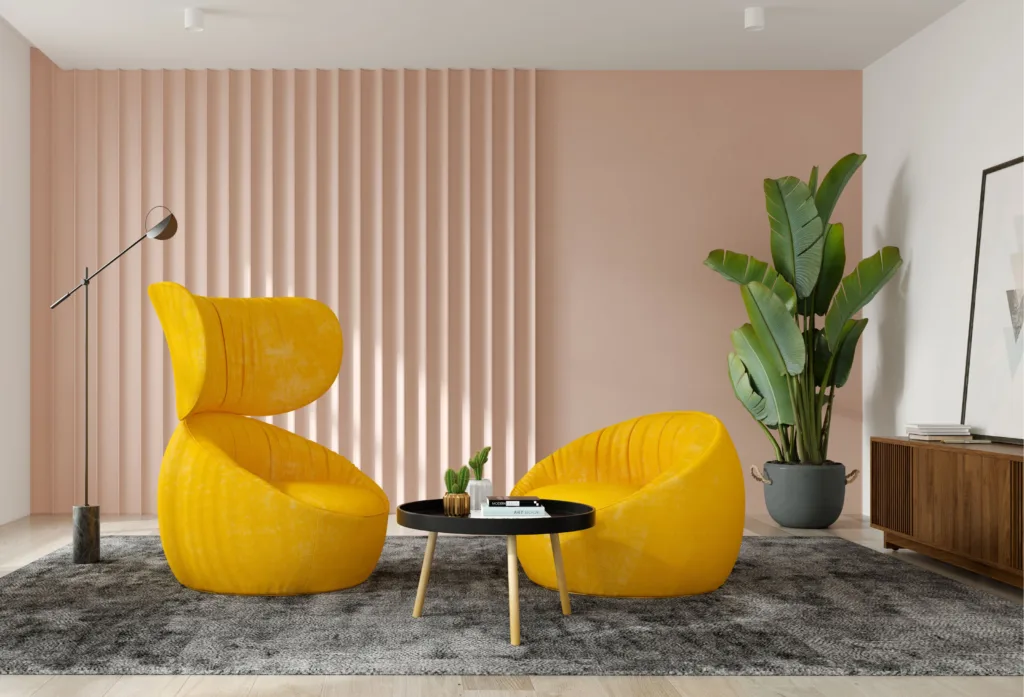
3. bold and bright contrasts

❤️ In the realm of interior design, bold and bright contrasts are an effective way to create visually striking living spaces that capture attention. Designers often leverage vibrant hues and contrasting shades to infuse energy and personality into a room. This approach not only makes a compelling statement but also allows for endless creativity and customisation, catering to a homeowner’s unique style and preferences.
Utilising bold colours, such as bright reds, yellows, and blues, can breathe life into a living room. However, when using such vivid tones, careful consideration must be given to the overall balance. Too much brightness may overwhelm a space and create an unsettling atmosphere. Therefore, designers must pair bold colours with softer tones, such as pastel shades or neutral palettes, to achieve a harmonious aesthetic. For example, a bright orange accent chair can be beautifully complemented by soft beige walls and a muted area rug, allowing the chair to stand out without dominating the room.
Contrasting colours can be applied in various aspects of the living room. This includes statement pieces such as a spectacular artwork or a distinctive coffee table. Moreover, utilising accent walls painted in a dynamic hue can enhance the focal point of the area, creating a captivating visual experience. To further unify the space, integrating accessories, such as throw pillows or decorative items, that echo the chosen colours will enhance the cohesive design.
Incorporating bold and bright contrasts offers a unique opportunity for homeowners to express their individuality while ensuring the living space remains warm and inviting. By balancing vibrant accents with neutral or softer tones, the top 10 interior designers in Mumbai create living rooms that are not only striking but also functional and welcoming. With careful planning and an eye for detail, a bold colour scheme can indeed transform a standard living area into a stunning showcase of style.
4. Earthy Tones

🏡 Earthy tones have long been celebrated in interior design for their warmth and comforting qualities, providing a sense of serenity and connection to nature. These colours, which include various shades of olive, rich browns, terracotta, and muted greens, evoke the natural world and can create an inviting atmosphere in any living room. Drawing inspiration from organic materials and landscapes, earthy palettes harmonise beautifully with a range of textures and furnishings.
One of the primary reasons designers gravitate toward earthy tones is their versatility. Whether used as a dominant theme or for accents, these shades can complement a variety of styles, from rustic to modern. For instance, a warm terracotta accent wall can serve as a stunning backdrop for minimalist furniture, while deep browns paired with soft green accents evoke a traditional yet cosy feel. This adaptability allows homeowners to express their personal style while ensuring the space remains comfortable and inviting.
In addition to aesthetic appeal, earthy colours contribute to a tranquil atmosphere, making them ideal for lounging and relaxation. Studies have shown that colours reflecting nature can reduce stress and promote a sense of calm, which is particularly beneficial in a space designed for leisure. Incorporating elements like potted plants or natural wood finishes alongside an earthy colour scheme can further enhance the organic, soothing environment of the living room.
Moreover, earthy tones allow ample opportunity for layering and contrast, encouraging a multi-dimensional approach to design. Different shades can be combined in upholstery, wall coverings, and decorative elements, creating a cohesive yet dynamic look. Therefore, opting for an earthy palette may not only beautify the living room but also enrich the emotional experience of the space, making it a true sanctuary in the home.
5. Shades of Blue and Green
🏡 The integration of blue and green shades within living room design cultivates an atmosphere marked by tranquillity and serenity. These colours are often associated with elements of nature; blue evokes the expansive sky and calming oceans, while green reflects the vitality of grass and trees. This natural connection promotes a sense of relaxation, making these hues ideal for creating a peaceful retreat in a home setting.
Among the various tones available according to Luxury interior designers in Mumbai, soft pastels like mint green or powder blue can foster light and airiness, especially in small or dimly lit spaces. On the other hand, deeper tones such as navy blue or forest green provide richness and depth, effectively grounding a living room without making it feel claustrophobic. Designers often utilise this versatility to create spaces that resonate with both style and comfort.
Successful examples of this colour scheme abound in modern interior design. For instance, a living room adorned with a teal accent wall can harmonise beautifully with crisp white furnishings, resulting in an elegant and refreshing aesthetic. Similarly, pairing sage green with warm, neutral tones can establish a cosy yet sophisticated environment. These combinations not only highlight the vibrancy of the chosen shades but also enhance the overall composition of the room.
Additionally, blue and green hues can be complemented by various textures and materials. For example, incorporating natural wood furniture or woven textiles can enrich the sensory experience, making the living room feel even more inviting. In essence, the use of blue and green shades contributes significantly to the creation of a living room that is both visually appealing and soothing, allowing inhabitants to unwind and recharge in a serene environment.
6. Pastels for a Soft Touch
Pastel colours have long been a favoured choice among designers for creating inviting and serene living spaces. The use of soft hues such as gentle pinks, light blues, and mellow yellows contributes to an atmosphere that is both light and airy, perfect for enhancing the overall vibe of a room. These colours are often associated with tranquillity and playfulness, making them ideal candidates for a living room where relaxation and comfort are paramount.
Incorporating pastel shades can have a transformative effect on the dynamics of a living space. For instance, a soft pink accent wall paired with delicate white furniture can instill warmth and elegance, fostering an inviting ambience. Similarly, a combination of pastel blue and yellow can evoke a cheerful yet mellow atmosphere, striking a balance between energy and calmness. When utilised thoughtfully, pastel colours can serve to broaden the visual space, creating an illusion of a larger and more open environment.
Pairing pastels with bolder decor elements is also a technique employed by many designers. Doing so can introduce depth and complexity to a room’s aesthetic. For example, integrating a few vibrant throw pillows or a striking piece of artwork against a subdued pastel backdrop can create an eye-catching focal point. This juxtaposition not only elevates the sophistication of the living room but also allows for personal expression without overwhelming the serene essence that pastels provide.
Ultimately, choosing pastel colours for a living room lends itself to a versatile and airy design. These soft shades can harmoniously coexist with various styles, from modern minimalism to more traditional settings. Their ability to evoke emotional responses while maintaining a tranquil environment makes pastels a timeless choice in interior design.
7. Colour Psychology in Design
❤️ Colour psychology plays a pivotal role in the realm of interior design, particularly when it comes to living spaces. Every colour evokes certain emotions and reactions, influencing how individuals perceive and interact within a room. For instance, warm colours such as reds, oranges, and yellows can stimulate feelings of warmth and comfort but may also evoke excitement or agitation. In contrast, cooler colours like blues and greens encourage relaxation and tranquillity, making them ideal choices for creating a serene living room environment.
Understanding the psychological effects of colour can guide homeowners and designers in making more informed choices about their living room colour schemes. For example, if a space is intended for social gatherings and lively interactions, colours that incite energy, such as vibrant yellows or lively oranges, may be suitable. On the other hand, for a space meant for relaxation and unwinding, softer hues like pastels or muted tones may enhance the tranquil atmosphere.
Moreover, the symbolism associated with specific colours can also inform design choices. For example, blue is frequently connected with trust and peace, making it a popular choice for shared family spaces. Green often symbolises growth and renewal, creating an inviting atmosphere that fosters connection among family members and guests alike. Neutral colours, such as greys and beiges, can provide a balanced backdrop that allows for flexibility in furnishings and decor, enabling homeowners to easily switch accents as their preferences change.
Ultimately, the interplay of colour in the living room can significantly affect the overall mood and functionality of the space. Designers leverage these color associations to craft environments that not only look aesthetically pleasing but also resonate with the inhabitants’ emotional needs. Incorporating an understanding of color psychology into the design process can enhance a living room’s impact, making it a truly welcoming and enjoyable space for all.
8. Practical Tips for Choosing a Colour Scheme
✍️ Selecting the right colour scheme for your living room is crucial, as it sets the tone for the entire space. To begin, consider your personal style and the overall theme you wish to convey in your living room. Whether you prefer a modern, traditional, or eclectic aesthetic, your colour choices should align with those preferences. Use colour-matching tools available in paint stores or online to help visualise your options. These tools can help you see how different colours interact with each other and guide your decisions.
Another critical factor to consider is lighting. The amount and type of light in your living room can dramatically affect how colours appear. Observe your space at different times of the day to understand how natural light and artificial lighting impact your chosen colours. For instance, warmer colours may appear even more inviting under incandescent bulbs, while cooler shades might appear crisper in daylight. Thus, it’s advisable to test paint swatches in the actual environment where they will be applied and observe how they transform throughout the day.
Using samples is an effective way to visualise outcomes before committing to a full paint job. Obtain small tester pots of chosen colours and apply them in swatches on your living room walls. This process allows you to see how each hue interacts with existing furnishings and décor. Furthermore, it can help you determine if the colour scheme feels cohesive with the overall atmosphere you want to create. Take your time with this decision-making process, as a well-planned colour scheme can elevate your living room into a refined and harmonious space.
Conclusion:
🤞🤞In conclusion, the significance of colour schemes in the living room cannot be overstated. They play a crucial role in establishing a cohesive and inviting atmosphere, making it essential for homeowners to thoughtfully select their palettes. The six colour schemes discussed throughout this blog post serve as reliable templates that designers frequently utilise to create stunning interior spaces. By opting for combinations such as monochromatic, complementary, or analogous colours, one can effortlessly enhance the aesthetic appeal of their living areas.
It is also important to remember that while these schemes provide a solid base, personal preferences and individual lifestyles should guide the final decisions. A well-designed colour palette should not only reflect current design trends but also resonate with the residents’ tastes and desires. This balance will ensure that the living room feels both stylish and personal, ultimately serving as a welcoming retreat for everyone who enters.
Readers are encouraged to embrace the freedom of experimentation while incorporating these time-tested colour schemes in their own homes. Colour can profoundly affect mood and perception, so finding the right combinations can transform a mundane space into a vibrant and inviting haven. The ultimate goal is to create a living room that is not only visually pleasing but also provides comfort and joy for those who use it. Therefore, take the time to explore various possibilities, mix and match colours, and ultimately discover the perfect living room colour scheme that harmonises with your unique identity.